Dear Netflix, Please Improve Your Website
Netflix is plagued by horizontal navigation and limited access for non-members. Forcing people to renew their membership just to see what content is available is very poor design.

By. Jacob
Edited: 2018-01-17 23:25
We'll have you watching Netflix again in no time.
Just a couple of quick things first. Which plan would you like?
Ok, so I like to relax watching movies sometimes. These days I seem to enjoy movies more than computer games, and in fact, I have not really played any games seriously for years. It seems I have lost interest in games, or maybe life has just become too busy, with too much stress.
Anyway, I am really tired of the website layout of Netflix. My membership is currently expired, but I am considering renewing it. The only problem is that I can not view their content before renewing my membership.
So, Netflix – please update your website design!
Currently I have to go to third-party websites to check what movies are available, and that is just unnecessary. It does not have to be this way. It is poor design.
Web design of Netflix.com
I never really liked the design on Netflix, and the way you have to browse movies. I do not think they hired the right designers, because clearly they have a poor sense of usability. It is hugely annoying having to browse sideways, and I think it would be a lot easier if all movies was laid out in a display:flex; list, designed with a mobile-first principle. The movies should not be hidden from view, unless exceeding a certain number of elements on the page, in which case they should instead use pagination.
There are other neat ways to create good layouts with CSS, that also excludes horizontal scrolling. Scrolling should usually be kept vertical (overflow-y:scroll;), and you should rarely hide elements on a page, unless there is truly no room for them. This is not the case on Netflix. The reason they have no room, is because their design is clumsy. It uded to annoys me that I could not get a good view of their videos, and it was difficult to find the movies I was looking for.
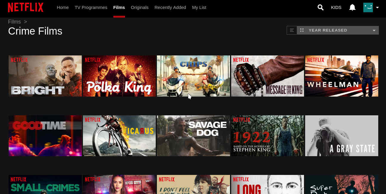
Luckily, they have improved a lot since then, and now I can sort the view more to my liking. I prefer sorting by "year released", since that puts recent content first in the view.

However, when I login after a longer break, I am still prevented from seeing the content unless I renew my subscription. I think this is a even worse design mistake than their horizontal navigation, because it locks people out, and forces us to go to other sites to check available content.
We'll have you watching Netflix again in no time.
Just a couple of quick things first. Which plan would you like?
In short, the Netflix many of us love is plagued and limited by poor web design. We only use it because we do not know of better alternatives. Maybe I should start looking for some?

Tell us what you think: