
Google Added Annoying Fixed Header to Result Pages
Google recently started showing the infamous fixed header on their result pages.

By. Jacob
Edited: 2018-12-02 04:05
Google recently implemented a fixed header design on their search engine result pages (SERPs). The header has an additional search field, which is competing with the already build-in search functionality in browsers.
This decision could very well be the worst web design decision in the history of Google.
I know from my own personal experience that fixed headers are hugely annoying to users, and thereby bad for UX. It can be done in ways it does not interfere with usability, but usually I do not recommend it. For the same reason I do not recommend having (any kind of) popup with close a button.
Popups are related to fixed headers, maybe even worse
For popups, the close button is usually made impossibly hard to hit on mobile devices. This is without mentioning the disruption it causes to the browsing experience. In the EU, GDPR creates a whole category of issues on its own, but often it also results in impossible-to-close popups. Sometimes you can not even accept those things.
Fixed headers can not even be closed, and so they tend to be worse than brief popups. Besides, you can choose to show popups only to loyal, returning users, increasing the chance they might respond to your message, and not be disrupted by it.
Bad UX and UI
I mean, they take a core service (search), and add a almost totally redundant fixed header, with no consideration of people using small screens. I also criticized this for webmaster tools (now known as Search Console), when they did the re-design.
As a user, I am really annoyed by fixed headers. Often, I find myself using plugins to disable whatever fixed elements web designers have plastered carelessly on web pages. It annoys me greatly, and I will not have it in my browser. Even when I am home at my 1920x1080 monitor, I still find fixed headers annoying.
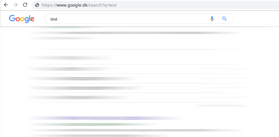
In this case, the screenshot speaks for itself. It takes no genius to understand why having two input fields next to each other is bad. I am aware the address bar is not quite the same, but it serves the same function – and besides, I have no need or desire to have a fixed header on SERPs.
They could at least add a small button to close the header for users who are inconvenienced by it. Some browser plugins allow people to pick elements from the screen for easy removal. I think most well known ad blockers have this "feature". Although this feature was likely intended to block ads, it also works for fixed elements.
Tell us what you think:
As well as using that book mark killer by Alisdair McDiarmid there is Chrome extension called Sticky Header Hider aka Fixed Header Fixer.
https://chrome.google.com/webstore/detail/sticky-header-hider-aka-f/eagncneohcoiofhknkofdobphnhgblad?hl=en
It is a matter of time when that won't work if they display the search results onto a fixed element like they did to the Chrome store. Sometime it works great but not without issues that you have to watch out for. It makes Google Product Forums look good when complaining about these things in that the bars at the top are not stuck there in a fixed part of your vision when you stare at the screen reminding you that is is a forum and what topic you are on. I don't like depending on plugins to manage this behaviour of wanted spammy things stuck there that could be unwanted and does a good job at serving as a distraction.
I have no problems with fixed headers, it is just that they set them with no display options in a way that denies the user a choice over their screen area when unwanted. No close button.
Assumptions are made by the developers? or designers? about what users want to see constantly, without any consideration for if it is unwanted... and now a navigation bar, once help has now been turned into a nuisance by going past helpful.
It to me is spammy behaviour I previously found with aggressive advertising and banners that use to do all sorts of things like stick things on that don't belong pages or interfere with it. It should be down the individual user what they want to see not one or a few or assumptions that are in themselves limiting to the user... and limits screen area.
I opened a topic:
https://productforums.google.com/forum/#!topic/websearch/sXbF7P4pi88
and one before that when they were testing it and I left feedback:
https://productforums.google.com/forum/#!topic/websearch/-OSdmLsUk88
No choice just ram it in their faces constantly.
I want to see the whole screen area and not want bits cut off for things that I only need for a couple of seconds and only when I need it.
It is my screen area not yours, it belongs to me, get your hands off it and go away!