
New Google Search Console Layout
Google just enabled the new search console for users, and I had the chance to check it out. Sadly, it has a huge fixed header, making it difficult to get a good view on smaller screens.

By. Jacob
Edited: 2018-12-02 04:04
Google just released their new Search Console for everyone to try out, but I must say, I am not a fan of the new layout. While they seem to be aiming for consistency on their platforms, which is not a bad thing, they have sadly implemented a humongous fixed header. Most recently, Google also added a fixed header in their YouTube Studio Beta layout.
Fixed headers can be really bad for the usability of a website. I have seen a few good examples where they are in use, and Facebook is one of them. However, most sites will end up feeling cumbersome to use. In YouTube's case, the header is simply to big. Which is also my main complaint about Google's new Search Console design:
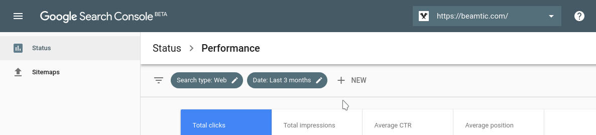
I have a low-resolution laptop screen (1366x768), and this makes it incredibly annoying to use these new Google layouts. Zooming out helps a little, but it messes up the font-size of the page. One possibility is to block/hide the header so the element – but this is a technical process that I would rather not get into. I do not mind Facebook's header so much, because here the design is really compact and neat.
So what is the deal with fixed headers? Why are some web designers obsessed about them? I am sure most of us advanced users hate them, but apparently web designers love them.
Why fixed headers are bad
If you really think about it, I think it should be obvious why fixed headers are mostly bad. The main problem is, of cause, that the fixed elements will take up screen real estate, which is more precious on devices with smaller screens. We can not simply assume that users have full HD monitors. Our designs should ideally be created to work in a variety of different resolutions. All the way from mobile to the desktop. With few exceptions.
Another problem with sticky headers is the tendency towards keeping navigation links in drop-down menus, and using a one-column layout for the page. This is easier to style with mobile devices in mind, but it feels really cumbersome on PCs. The drop-down navigation is not so much a problem on mobile devices, but on the PC, you kind of expect instant access to navigation links. If there is room enough for a multi-column approach with vertical navigation, then I would prefer this in many cases. Today you can easily design a responsive layout with CSS Media Queries.
To many users, myself included, sticky headers (and other elements) feel intrusive and distracting. Some websites manage to pull it off nicely, but in those cases, the header-height will typically be very small.
If the user has plugins installed in their browser, or even if they are showing a bookmark bar, fixed headers at the top will be even more annoying.
Tell us what you think: