
The Cumbersome YouTube Studio (Beta) Layout
YouTube is creating a new creators studio, and it currently suffers from usability issues.

By. Jacob
Edited: 2018-12-02 04:03
The new YouTube Studio beta includes a huge side menu and a fixed header, which I think is poor use of screen real estate, and it causes usability issues on smaller screens. The side menu takes up too much screen space, and it can not be closed. The same is the case with the fixed/sticky header at the top of the screen.
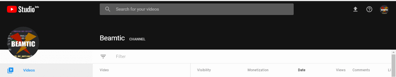
The part attached below the header is even more annoying. Having fixed elements on a page is something I generally dislike, because it is very hard to do in a good way, without disrupting the users view of the content itself.
The performance issue is not making things better. Scrolling down on the site causes huge lag on my laptop, (i3), which is entirely unnecessary. I really think we should avoid using JavaScript for layout purposes, unless such use is really necessary. I do not think it is in this case.
So called "fixed" and "sticky" headers will often end up compromising otherwise good website layouts. I have only seen very few sites accomplish using them well, (Facebook and Twitter is among a few others). The rest just feels annoying and cumbersome to navigate. Some sites with fixed headers also have performance issues, likely because they use poorly optimized JavaScript to make animation effects. But who knows what the reason might be? I do not personally use such scripts, as I prefer keeping things clean. That is plain HTML/CSS, with minimal use of JavaScript. I do not really have anything against using JavaScript, I just try to avoid overdoing it.
The new layout on YouTube seems to be part of a larger re-design aiming for consistency. Recently, Google Search Console got a similar update, also suffering from fixed page elements.
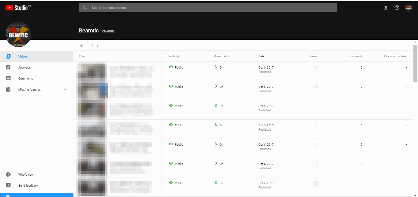
YouTube Studio Beta
Luckily the new design is still only in beta, so we can hope that they will abandon the idea about having a fixed header, and instead leave the header at the top of the site, when scrolling, where it belongs. Alternatively they might be able to learn from Facebook, as the header on FB does not take up nearly as much space.
It would seem they tried to compensate for the header size problem by re-sizing the header when scrolling. But this raises its own issues. Mainly, the header is still too big, and while it is getting re-sized, it freezes up my browser for 1-2 seconds – which I find very annoying. This shows me that, likely, they are aware that the header takes up too much space, but they just did not manage to solve it very well.
I have a small laptop screen, and I hate being forced to scroll to view more information, just because websites insist on having a huge fixed header. It is even worse then poor use of scripts causes a page to freeze up, as is the case with both YouTube and Google Plus.
Margins in the new layout also seems to large, which is just contributing towards limiting the space that is available on a screen.
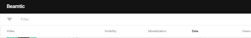
Screenshot of fixed part, below channel names:
Zooming out improves usability
Due to the poor use of space, I tried zooming out, which seems mitigate the problem a little. I still have the annoying fixed part above the main (also fixed) header. But at least I am able to view more information when I zoom out.
A zoom level less than 75% would start getting uncomfortable to view. After zooming out as much as possible, I would at least be able to view more content, though still far from ideal. The result can be viewed in the below screenshot:
I do not think zooming out is an ideal solution, and I am still annoyed my the fixed sub-header part, because it takes up too much space on small laptop screens.
As it stands now, I would much rather keep the old layout on YouTube, since it allowed me to view more information on screen, and it also did not freeze up my browser.
Tell us what you think: